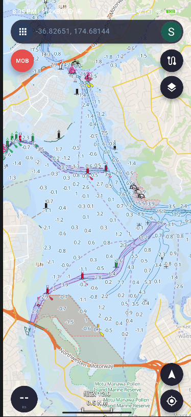
Change request - menu buttons
You are using non standard android buttons to trigger menus
It took me more than 3 weeks to find out that the Fn button triggers an action menu
If use the standard android buttons 3 dots or 3 dashes and placed outside the search bar, it would be easier to recognise as a menu trigger, you can still label it as you like, but non standard abbreviations can be confusing
Thank you for your suggestion. I’ll change it to the standard three-line menu button. I think this will make it much easier for users to recognize and understand.
Thank you for the feedback. I agree that the previous “Fn” icon was not intuitive enough and could be confusing.
I have now changed it to a more recognizable menu icon. This change will be included in the next release, which is expected in early September.
I’ve attached a screenshot for your reference. Thank you again for the helpful suggestion!
Thank you for the response
I believe that if you detach it from the search bar and label it as function or actions it will be even more recognised
Also, if you decide to detach it, you can place it anywhere on the screen or make it floating to be draged any where
Thank you again
Have a lovely day
Thank you again for the thoughtful suggestion.
If this were a completely new app, I would fully agree with your approach. However, the current layout has already been used for some time, and existing users have gradually developed their own habits around it. Making a major change to both the icon and its location at the same time could create a different kind of confusion for those users.
It is a little similar to your experience moving from OsmAnd to another app — after becoming familiar with OsmAnd, you naturally expected to find certain controls, such as the zoom buttons, in a familiar place.
For this reason, I think the better approach for now is to improve the recognizability of the button while keeping its general location consistent. In the future, I may also consider allowing users to customize or reposition more controls themselves.
Thank you again for sharing your ideas. Feedback like this is very helpful when balancing improvements for new users with the habits of existing users.
Thank you for the feedback
I fully understand your very valid concerns
As a new user I must accept that there will be learning curve and a change in habits.
In the future, I will still point out what I think can improve the usability and I'll also try to take in account the impacts on existing users and the amount of work you have to do
I sincerely thank you for the effort and time you spend to satisfy the needs of others
Thank you again and have a lovely day
Thank you very much for your kind words and understanding. I really appreciate it.
Please don’t hesitate to continue sharing any ideas or suggestions you have. Even if a suggestion cannot be implemented immediately, it is still very valuable to me and helps me understand how different users interact with the app and where the usability can be improved.
You also don’t need to worry too much about the amount of work involved — I will always evaluate each suggestion based on usability, development effort, and the impact on existing users, and then decide the best way to approach it.
Feedback from users like you is one of the most helpful parts of improving the app. Thank you again for taking the time to test it carefully and share such thoughtful feedback.
Have a lovely day too!
 SEA CHART