Refinement: Deapth point font colour
Greetings
At the moment, the deapth is very difficult to read
The most visible colour on blue background is yellow-orange. it is visible on both light and dark blue
Perhaps you can test changing changing the colour to orange, use a sanserif font and increase the size on or 2 points and see how it looks
ultimately the choice is yours
Thanks again
Cheers
Hi, thanks for the suggestion. Let me think about this a little more.
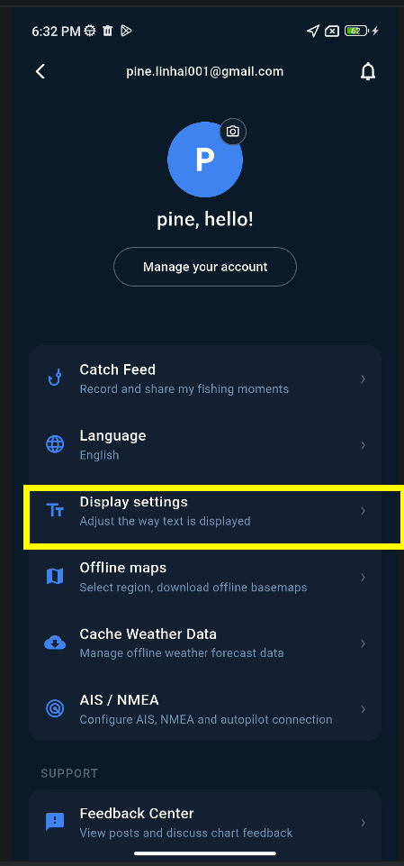
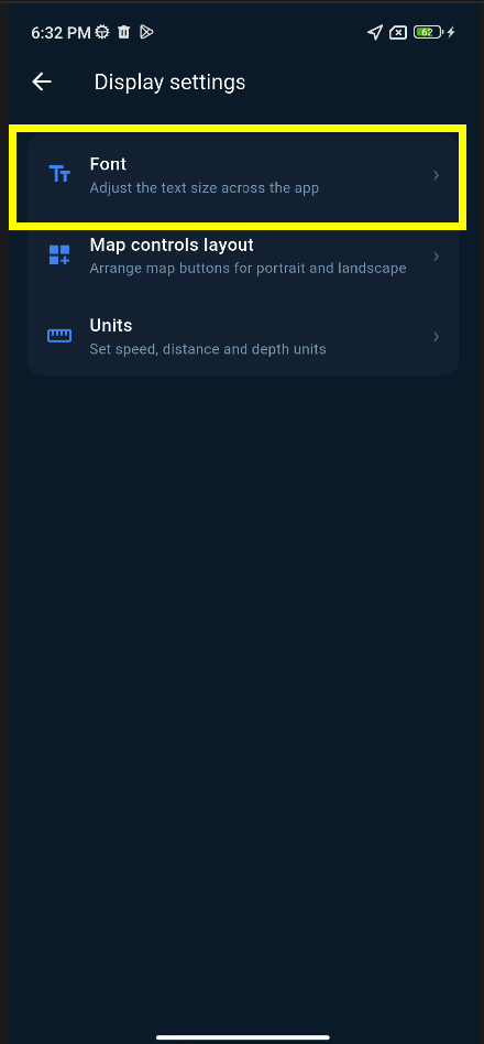
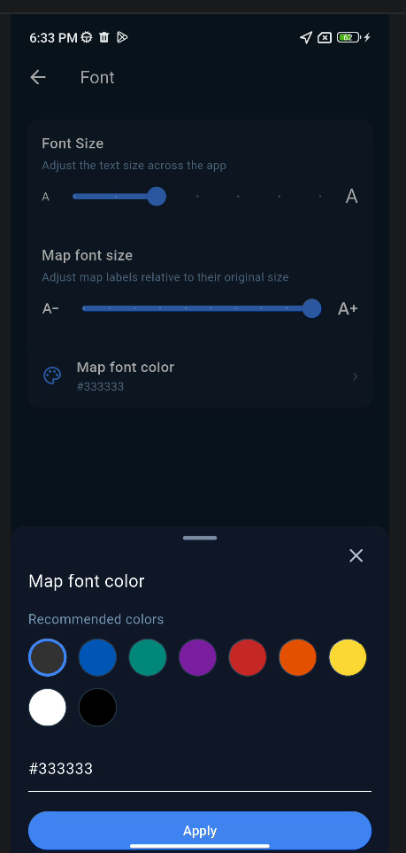
The next version will be a stable release. After that, I’ll look at whether the depth font size can be made configurable in Settings, so users can adjust it to their preference.
Thanks again for the feedback!
Now I can read
Thanks
And thanks for the text editor, great improvement , love it
(can't add smilies or emogies? )
Another note
The fonts used seams to have a white outline, this makes it look fuzzy
Can you at your spare time test sans serif font monospace fonts
I believe that it will make the text sharper and easier to read
Loads of free fonts available
https://www.dafont.com/theme.php?cat=501
and loads more online
Thanks again
Cheers
 SEA CHART